Black loading icon spinning in a loop.
Mindnow
·
2023

A website redesign that brings the company’s spirit to life

White loading icon spinning in a loop.

Summary

Problem statement

After growing for five years, Mindnow transformed from a small digital marketing agency into a global development powerhouse with over 40 employees. Yet, the existing website no longer meets the needs of prospective clients, partners, and job seekers, as it fails to convey the company’s new positioning and capabilities.

Solution

The solution is a completely redesigned website that brings the company’s spirit to life.

Role

As a co-initiator and the main person responsible for the repositioning, I led the complete redesign of the website as a lead product designer.

Mindnow is a Swiss startup offering digital product development with nearshoring solutions.

Result and handover

The branding and website redesign is more than just a fresh coat of paint – as Jean-Paul Saija (Co-CEO) aptly described it:

“A quiver full of arrows.”
— Jean-Paul Saija, Co-CEO at Mindnow

It’s a memorable story, a brand to be proud of, and a website that ties it all together.

On leaving Mindnow, I handed the project over to the team. Mindnow now faces challenges such as development, content creation and a clever communication strategy. In order to successfully realize the concept, I recommended a step-by-step and fragmented approach (quality over quantity). Aditionally, due to the unconventional interaction design, I proposed conducting a usability test.

A UX concept is always just half the battle and remains a hypothesis. Only exceptional execution, evaluation against clear key performance indicators (KPIs) and iterative user-centered optimizations determine whether a UX concept unfolds its full potential. I wish Mindnow every success in achieving this.

Product vision

The new company valuesEntrepreneurial, Can-do and Noware not just buzzwords, but the core of what Mindnow is all about. With Mindentity, a generative logo system that adapts individually to each team member, the spotlight is on the people behind the projects. The rebranding’s benchmark slogan captures this perfectly:

“We don’t have a corporate identity – we offer mind identities.”
— Stefan Vogler, markenexperte.ch (brandexpert.ch)

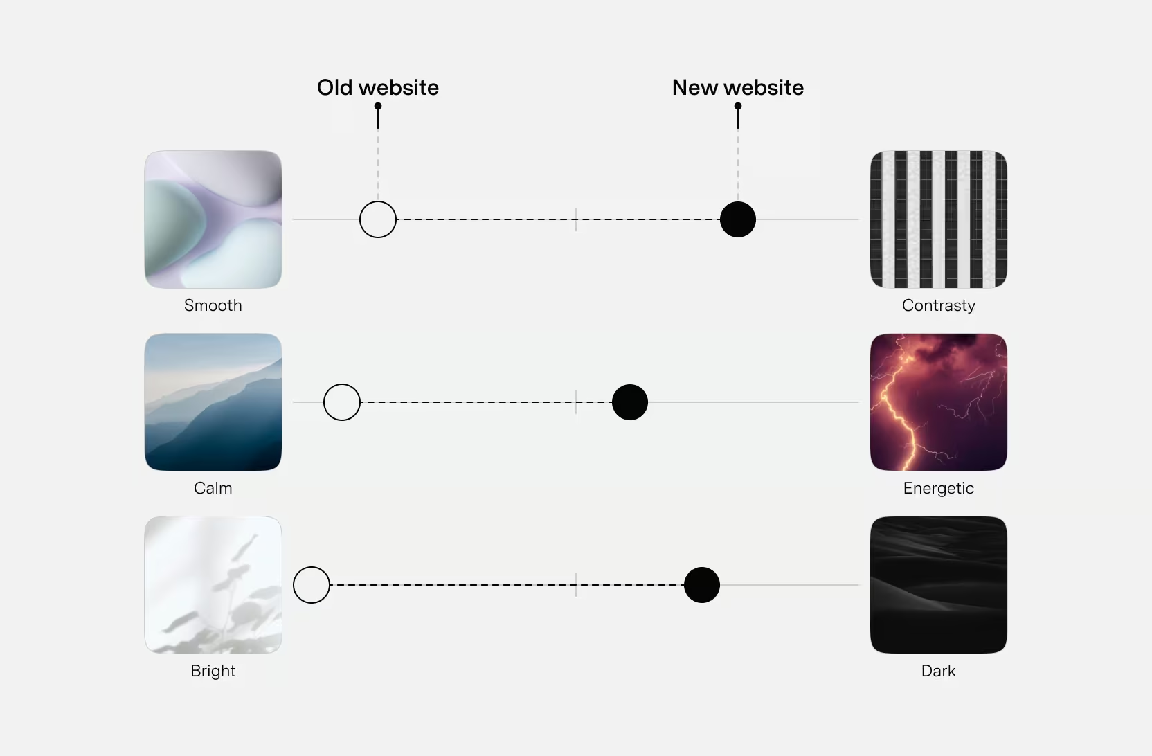
Instead of just listing services and references, the website should bring the company’s spirit to life through the user experience.

Marketing is ultimately about triggering an emotional response that leads to the desired action. If these emotions can be evoked, the goal is achieved.

3 key challenges

With the website, Mindnow has the opportunity to present its “digital product development” expertise directly. However, weak implementation carries the risk of appearing semi-professional and losing momentum.

To make the most of this opportunity, three key challenges need to be overcome:

  1. Develop a creative concept that brings Mindnow’s company spirit to life.
  2. Convey the brand story concisely and memorably within seconds.
  3. Help to increase brand equity among the target groups.

5 personas

James (UX Intern) and I initially developed five personas and refined them through interviews with target group representatives. These were based on four previously defined target groups, which we identified by analyzing existing data (e.g. Google Analytics) and client interviews.

Role-based personas divide into primary and secondary groups, featuring AI-generated portraits to enhance empathy.
We created the images with AI. The exaggerated portrait helped us to enhance empathy for the personas.
Graphic: Lyle Peterer
Persona visualization featuring role-based model details, including motivations, frustrations, goals, bio and demographic data.
For the visualization, we used the role-based persona model as a guideline.
Photo: Lyle Peterer

Creative concept

After conducting a high-level competitor analysis and identifying three benchmark websites, I turned to the first major challenge: the creative concept.

The main question was: What makes the user experience of the website unique?

In order to set ourselves apart in the user experience, I identified three differentiating features by analyzing the homepages (first impressions) of 25 companies within the same industry.

Screenshots of 25 company homepages identify differentiating features in user experience and first impressions.
25 screenshots of homepages
Graphic: Lyle Peterer

Three differentiating features

  1. Our homepage must be interactive: Instead of static content, we demonstrate the advantages of digital products: accessibility, dynamic data, interactivity, and motion.
  2. Our homepage convinces through actions, not words: Instead of paraphrasing (e.g. a mission statement), we prove our capabilities directly through execution.
  3. Our homepage tells a story without images or videos: We rely on interactive experiences rather than static media.

To transform the differentiating features into specific solutions, I initiated a creative concept pitch. Together with two UX designers and within a 4-hour time limit, we gathered ideas that we presented to stakeholders, including developers. This resulted in a central solution that was largely based on my proposal.

On first load of the website, an animation visually explains the abstract shapes’ purpose while the content loads, creating the illusion of a dynamic and fast experience. Afterward, there is no header with a logo.
Animation: Lyle Peterer
A mobile interface features a minimalist design and a half-cut interaction pattern.
A minimalist mobile interface incorporates a half-cut interaction pattern, to increase curiosity.
The menu is positioned in the thumb zone and resembles app navigation design. Intuitive web-app gestures like swiping and scrolling allow users to navigate intuitively.
Animation: Lyle Peterer
The website is designed like a three-dimensional space. On the meta level, users get the most important information. If they want to dive deeper into a topic, the third dimension (in-depth page) opens – similar to a popup.
Animation: Lyle Peterer
A mobile interface highlights an article by a team member, emphasizing authenticity and expertise.
Each in-depth page is written from the perspective of the minds, authentically conveying the team’s expertise and passion.
Photo of paper prototypes.
James (UX intern) and I started with rapid prototyping and guerrilla testing. These methods not only provide early insights but are also a lot of fun.
Photo: Lyle Peterer

Johannes Lijsen, Business Developer at Mindnow, expressed his enthusiasm for the creative concept and rebranding on LinkedIn:

“I love it, especially the killer mobile navigation and the whole concept around the Mindentity are just so genius!”
— Johannes Lijsen, public on LinkedIn (February 2024)

UX positioning

The next step focused on bridging the gap between the brand strategy and the final implementation.

A UX principle demonstrates its impact on the final result with a mobile screen.
With UX Principles, we defined clear guidelines that pave the way for a consistent and tailored user experience.
Graphic: Lyle Peterer
A positioning map compares brands on axes of innovative vs. proven and orderly vs. chaotic to guide user experience decisions.
Positioning ourselves in comparison to other brands helped us answer key questions, such as whether our user experience should feel conventional or extraordinary.
Graphic: Lyle Peterer
A comparison highlights the shift in website design priorities from smooth, calm, and bright to contrasty, energetic and dark.
In order to reflect the emotions targeted in the strategy, I set design priorities.
Graphic: Lyle Peterer

New information architecture (IA)

We developed the IA iteratively based on the personas. To achieve this, I designed a multi-stage card-sorting and workshop process. Following we validated the results through tree testing, which led to minor adjustments in the wording.

User requirements brainstorm board showing categorized needs, interests, and disinterests for personas.
User requirements: For each persona, we brainstormed requirements categorized as Need, Interested, and Not Interested.
Photo: Lyle Peterer
Affinity maps: We grouped the user requirements by thematic similarity and added suitable headings.
Photo: Lyle Peterer
Inverted pyramid: Lastly, we categorized the affinity maps into prominent, secondary, in-depth and niche. This set the stage for the creation of the new IA.
Photo: Lyle Peterer

3 special characteristics of the new IA

Mobile interface emphasizing the absence of a homepage.
No home page: There is no main “Hello, we are Mindnow” page. As users arrive at different subpages via different routes, we rely on their curiosity to encourage interaction.
Mobile interface showcasing team members’ insights and quotes.
Minds in the spotlight: We let our talents speak for themselves through quotes and dedicated sections.
Mobile interface showcasing clear navigation paths and a prompt to explore services.
No dead ends: Each page offers a continuation, clears doubts and invites users to dive deeper into our content.

First wireframes

Using the questionhow might we?” as a starting point, I gradually transformed the shapeless IA into wireframes. Beginning with so called “content formats”, I defined the content and functions, which resulted in numerous sketches and wireframes.

Photo: Lyle Peterer

My resignation from Mindnow required the design concept to be finalized before I leave. With ongoing client projects consuming all available resources, I worked independently from this point onward, creating the artifacts without team support.

Users and peers are among my most important sparring partners in the design process, alongside stakeholders. However, in this project, I largely missed this exchange. Additional perspectives would have significantly enriched the project.

Art direction

Parallel to the first wireframes, I turned the design priorities defined in UX positioning into ideas. I gathered inspirations, crafted various moods, and experimented extensively. Every failed idea served as a guide toward discovering the right approach.

The challenge was to develop an initial style direction from the new brand identity, which did not yet include a comprehensive brand design.

3 details

A color concept highlights tinted gray tones with red in shadows for warmth, blue in highlights for modern contrast and accent colors.
Color concept: The gray tones were given a red tint in the shadows (nostalgic / warm) and a blue tint in the highlights (frozen / modern) to enhance the contrast between black and white.
Graphic: Lyle Peterer
A website layout alternates dark and light sections
Alternating dark and light modes: The website is divided into sections that switch between dark and light themes. Inspired by glacier crevasses, this approach creates a clear structure while adding fresh visual accents.
Desktop user interface with large shapes and images.
Layouts to strengthen the brand design: In order to increase the recognizability of the brand, it was important to consistently use the signature elements of the Mindentity.

High fidelity design

All measures crystallized to a point where the variety of ideas and the complexity of the project resulted in a clear, final solution.

The result: a fast, dynamic and honest user experience, inspired by the Swiss style – minimalistic and energetic, with clear positioning.

Desktop interface showcasing a simplified, distraction-free design.
Mobile First: The mobile first approach helped me to simplify the desktop user interface – no frills, no distractions.
Contact section of a website offering multiple user-friendly options.
Contact at ease: We asked ourselves how could we make the contact as easy as possible for users? Our solution: The user chooses the way, we take care of the rest.
Desktop section featuring bold colors and typography to emphasize Mindnow’s unique selling propositions.
Bold statements: The intense background colors make a deliberate, provocative statement, while the strong typography highlights Mindnow’s unique selling propositions.

For data protection reasons fictitious personal names have been used.