Black loading icon spinning in a loop.
Ticketcorner (Sunrise starzone)
·
2022

From zero to a groundbreaking music platform in 3 months

White loading icon spinning in a loop.

Summary

Opportunity

Ticketcorner, the largest ticketing platform in Switzerland, saw an opportunity to go beyond ticket sales.

Solution

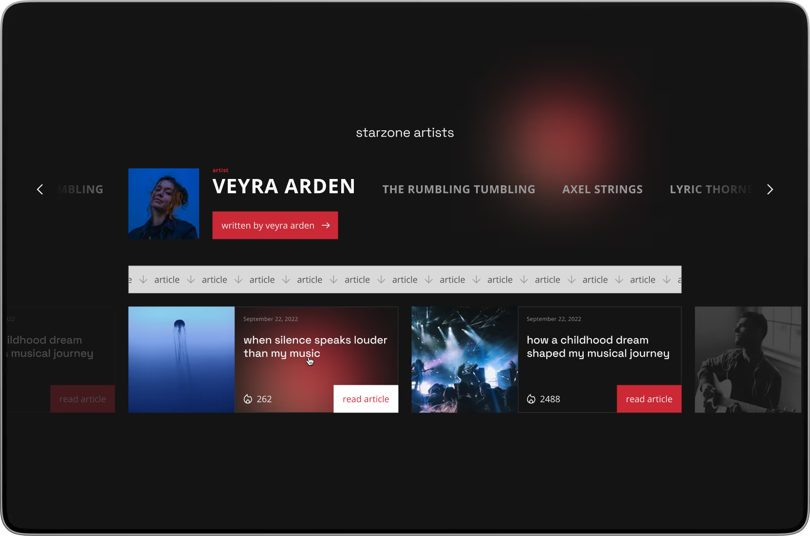
With the new brand “Sunrise starzone”, the aim is to revolutionize and strengthen the Swiss music market – creating a win-win situation for brands, artists, event organizers, and fans. An innovative online news and ticket platform forms the heart of this vision.

Role

In just three months, from the initial sketch to the hard launch, I took on a hybrid key role at Mindnow as lead product designer and co-product owner.

Mindnow is a Swiss startup offering digital product development with nearshoring solutions.

Monami is a Swiss full-service social media agency.

Okay Captain is a Swiss creative agency founded by two brothers, specializing in experience design.

Sunrise is the second-largest telecommunications company in Switzerland.

Ticketcorner is the largest ticketing platform and one of Switzerland’s strongest digital retail brands.

Successful launch

After the 3-month sprint, the website had thousands of users within a very short time. The team won renowned Swiss artists like Baschi as authors and convinced Die Mobiliar and Raiffeisen to join as partners.

“It’s a win-win situation. As a musician, I can build a different connection with my fans here, they get to know me in a different and very authentic way.”
— Baschi, quoted on ticketcorner.ch

Ticketcorner announced that Sunrise starzone achieved over 50 million gross impressions and sold more than 130’000 tickets in its first year, earning the Sponsoring Excellence Award 2023 in the “Pioneer” category.

“Sunrise starzone is a real revolution. For the first time, a logical and holistic bridge has been built in an otherwise highly fragmented market.”
— Oliver Niedermann (CEO Ticketcorner), quoted on ticketcorner.ch

Along the way, as Mindnow’s design manager, I was able to fulfill the design brief at a profit.

Three years later the website was relaunched, keeping the core principles of the information architecture.

Product strategy

At the heart of this vision is a digital music platform that combines editorial content and exclusive ticket offers such as a “Sunrise starzone lounge”. The aim is to use the platform to create a network effect that connects brands like Sunrise, artists (especially musicians), event organizers, and fans.

Example of a Sunrise starzone lounge:

An exclusive lounge at a festival, just for Sunrise customers. There, Sunrise and other brands could address their target groups directly, while artists sign autographs and create social media content.

Challenge

A launch in 3 months without a business plan or clear vision.

What we had:

  • A requirements list with over 100 entries as the basis of the project contract.
  • A verbal rough description of the vision.
  • A launch date in 3 months.
  • An estimate from Mindnow’s CTO Vadim that the development effort would take around 3 months.

The sticking point: How can development begin if the concept still has to be created from scratch and therefore no clear specifications are available yet?

Project strategy

In line with the motto “no risk, no reward”, I realized that we had to put in an enormous sprint to realize a comprehensive product vision in the shortest time possible – even if potentially buggy.

At the start of the project, I asked myself: Why should we do this? Neither a business plan nor a marketing concept were ready, and research, personas or user tests were not part of the project scope.

It quickly became clear that the vision did not originate from user needs, but was based on a business-identified opportunity. As Henry Ford supposedly said:

“If I had asked people what they wanted, they would have said faster horses.”
— Henry Ford

Rick Rubin, one of the most successful music producers, put it similarly in an interview:

“The audience doesn’t know what they want. The audience only knows what has come before.”
— Rick Rubin, 60 Minutes interview with Anderson Cooper

It was therefore a conscious strategic decision to test the idea directly in the market.

A project timeline outlining tasks from kick-off to hard launch in 3 months.
To make this sprint possible, all artifacts had to be developed simultaneously. This required all team members to pedal to the metal.
Graphic: Lyle Peterer

Vadim (CTO) led the development team, which began with a ramp-up and focused on API interfaces to Ticketcorner’s e-commerce. This gave us time to set the course for the design.

Social media like information architecture

During the ramp-up phase, we discussed the following questions in stakeholder meetings:

  • What information is presented where and for whom?
  • What context are the users in?
  • How do users behave on the website?

Meanwhile, Pavlo (Senior UX Designer) created a first draft of the information architecture (IA), which quickly provided a basis for discussion.

A linear, hierarchical sitemap featuring a dominant primary navigation axis.
A linear, hierarchical navigation design: The structure was based on clear terms inspired by conventional music industry news platforms.
Graphic: Lyle Peterer

Monami, responsible for the editorial content, found the IA’s first draft unsuitable. We concluded that users primarily access content via external links and view static news platforms as outdated.

An interlinked and dynamic sitemap featuring a supportive primary navigation axis.
Examples of possible user flows and high-level business objectives.
Graphic: Lyle Peterer

That’s why we came up with the idea of designing the IA in the style of a social media platform.

A linked and dynamic sitemap with a supportive primary navigation axis.
A linked, dynamic navigation design: The focus is more on dynamic content navigation rather than static, individual topic pages.
Graphic: Lyle Peterer

Following this, I spent hurriedly two hours creating a completely new IA.

Sketch of a sitemap.
This sketch was approved the same day by my supervisor Jakob (Co-CEO).
Photo: Lyle Peterer
Image of the final sitemap showing comprehensive navigation paths and content structure.
Final sitemap
Photo: Lyle Peterer
The challenge as lead product designer and co-product owner was to understand the IA and data model of the historically grown Ticketcorner website in the shortest time possible in order to create a seamless user experience.
Website navigation separating into two primary items: music news and events.
We divided the website into two primary navigation items: Music news and events. This provides clear return points for users and clearly presents the two main areas of the platform.
Content navigation organizing articles by topics like album reviews, new music, and interviews.
We assumed that users would primarily interact through scrolling and the appearing content. Therefore, we focused on content navigation.
A website section highlighting recommended articles and events.
We also prioritized content recommendations.
A website featuring highlights a clickable author link.
Like on social media platforms, everything is interlinked. Authors and tags are also clickable and enable a deep dive into the platform.

In no time, the new IA was approved by the stakeholders and the first milestone was reached. This resulted in a to-do list for the design team. The presentation of abstract artifacts, such as the sitemap, which was new to many stakeholders, proved to be very challenging and the start of a complex and unconventional workflow.

Unconventional workflow

In my hybrid role, I developed an unconventional workflow so that we could provide the developers with initial design artifacts after the ramp-up.

3 measures:

  1. For the iterative discussion and approval of the design artefacts with the stakeholders, I created a meeting structure that was synchronized with the Scrum meeting structure.
  2. Next to Pavlo (Senior UX Designer), I brought our most efficient UI designer Oleh onto the team and created a Kanban board for us. This enabled us to focus on individual increments. At the same time, the external design duo Okay Captain joined us to design the new brand and the sensory design (final user interface).
  3. On a weekly basis, we approved the design increments and made them available for development, which kept the developers’ backlog continuously filled. What is approved is coded and what is coded costs a lot of money. That’s why my communication skills were particularly challenged in the approval process.

Developers worked with prototypes by the end of the second month because branding was not yet finalized – an unconventional and courageous approach.

Mental model of the unconventional workflow.
Animation: Lyle Peterer

Tailored features

Our collaboration with Okay Captain and iterative decision-making enabled us to design tailored features despite the challenging circumstances. Okay Captain’s takeover of our mid-fidelity desigs automatically improved design quality through the effect of an “expert review”.

A website section showcasing content from artists and emphasizes bold design.
The section’s bold design highlights the unique selling proposition: content directly from the artists.
Hot tickets featuring in a website section.
With comments, journalists can add context to hot tickets and make them more engaging.
An audio player that visualizing a content format.
Various content formats combined with a headless CMS give journalists maximum flexibility.

Learnings

The project was flexible, but characterized by agile antipatterns such as “feature factory”. As lead product designer and co-product owner, I was able to contribute to both the concept and the development, which took my UX engineering skills to a new level.

In my view, debugging and focused user research measures would now be the best step to separate the wheat from the chaff.


For data protection reasons fictitious personal names have been used.