

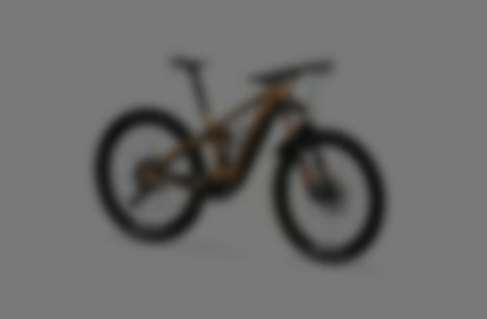
Thömus leads globally in customizable high-tech bikes, but customers struggle to visualize and configure their custom bikes independently, causing uncertainty and hesitation. On the other hand, the sales team lacks tools for remote, user-centered consultations, limiting customer experience and slowing international growth.
The solution is an award-winning e-commerce 3D bike configurator.
When I took over, a mid-fidelity 2D configurator prototype was already in place. I took on the role of lead product designer.
The launch marked the beginning of a long-term partnership between Thömus and Mindnow. Together, we won the Best of Swiss Web Award Bronze in the category “Technology” – the first award in Mindnow’s six-year history. Through my proactive and strategic consulting, I played a significant role as part of a dedicated team in achieving an upselling of ≈ 20 % of the initial budget.
The deadline was 45 days to transform a mid-fidelity prototype into a comprehensive product concept and ensure the timely start of the multi-month development phase.
The sales team urgently needed a solution to manage growing stocks and maintain sales momentum. An early launch was crucial.
Thömus aims to expand the brand internationally. This led to the long-term vision of largely digitizing the Thömus experience: From the first touchpoint with the brand to the delivery of the bike and participation in events.
With an online 3D configurator, the sales process is no longer tied to a specific location and the customized bikes are given a realistic appearance within seconds. Two birds with one stone.
The first step in a grand vision.
The majority of the design budget had been used up. To achieve the project goals, I needed a powerful team while finding a way to conserve resources. Oleh, our most efficient UI designer, and Roman, our most versatile junior UX designer, formed the cost-effective backbone.
The mid-fidelity prototype had not yet been subjected to a user test before I took over the project. Due to the limited resources, in consultation with the development team I formed a project strategy in which design and development were closely interlinked so that a user test could be carried out.

Co-CEO Jakob saw this as an opportunity and additionally entrusted me with the overall project management and the management of the development team as Product Owner.
The focus lay on two primary user groups.

With conflicting requirements and limited resources, we had to carefully balance the needs of both user groups. We knew the product could fail if either group was dissatisfied.

The current mid-fidelity prototype risked overwhelming 60-year-old customers with little technological comfort, according to the principle of “cognitive load”. There were many possibilities to satisfy both user groups equally, but the budget set clear limits.
A central idea that exceeded the available resources was the expert mode. Non-experts would have a simple experience, while advanced users (e.g. salespeople) could use the full complexity.
We were tasked with building a stand-alone configurator, including e-commerce. To achieve this, we worked backwards from the mid-fidelity prototype, leveraging as many existing elements as possible to ensure a high level of consistency.


To ensure a seamless user experience, I collaborated with developers to define a clear overview of breakpoints. This allowed us, as designers, to make more informed decisions about the logic and maintain a consistent responsive design. At the same time, this approach helped to minimize the effort required in frontend development.


Each key feature was carefully revised and integrated in close collaboration between designers, developers and stakeholders.
Using my custom-developed method, the “Focus Shift Challenge”, we were able to improve solutions within minutes, ensuring higher quality despite time pressure.


To ensure a highly consistent user experience, we created a comprehensive design system and a digital brand style guide for all future digital projects from Thömus.
The brand style guide provided by a branding agency served as the basis. However, it required adjustments to suit the needs of a complex web app, which I spearheaded. Two main changes:
As Design Manager at Mindnow – a role I held alongside the Thömus project – it was important to me to document the design system in detail. The aim was to strengthen the autonomy of the frontend team in design-specific questions and provide them with a solid foundation.
Lacking resources for a clickable prototype, I developed the solution to conduct a usability test directly on the live configurator through a soft launch. This enabled us to gather valuable, user-centric feedback at an early stage of development and implement crucial optimizations in a timely manner.
We invited three groups to take part in the usability test: Thömus employees, former customers and potential new customers. Each group went through a series of tasks and answered questions about their experience. Testing with the early development stage of the live configurator was a challenge and had a negative impact on the test results. Nevertheless, we were able to gain crucial insights.
Laura (UX researcher) and I supervised the test while James (UX intern) handled the execution.
Pain points: Onboarding confused users about where to start with the configuration. Many also did not realize that the 3D model is interactive.
Approach: Together with UX writer Marina and intern James, we used a user journey map to spot the causes.

Pain points: Most customers do not buy a bike in this price range without personal advice. Users were therefore unsure how to send their configuration to Thömus.
Approach: In close coordination with Thömus, the development team and the design team, I gathered requirements and defined one leading question: How can we make it as easy and pleasant as possible for users to get in touch?

Excellent user experience is not created beforehand but throughout the entire product development process. It emerges through iterations across all phases, interdisciplinary collaboration, continuous exchange with users and a shared understanding of quality.